The Problem
As development on the Benefits Dashboard was about to begin, stakeholders raised concerns about its usability. They worried it could frustrate users and make it harder for them to access their benefits smoothly.
Solution Preview
The video below shows the happy path a user might take when they access the Benefits Dashboard.
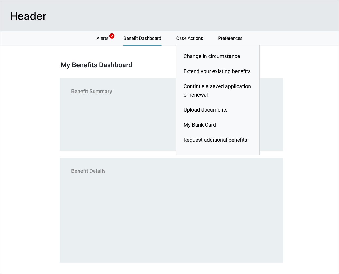
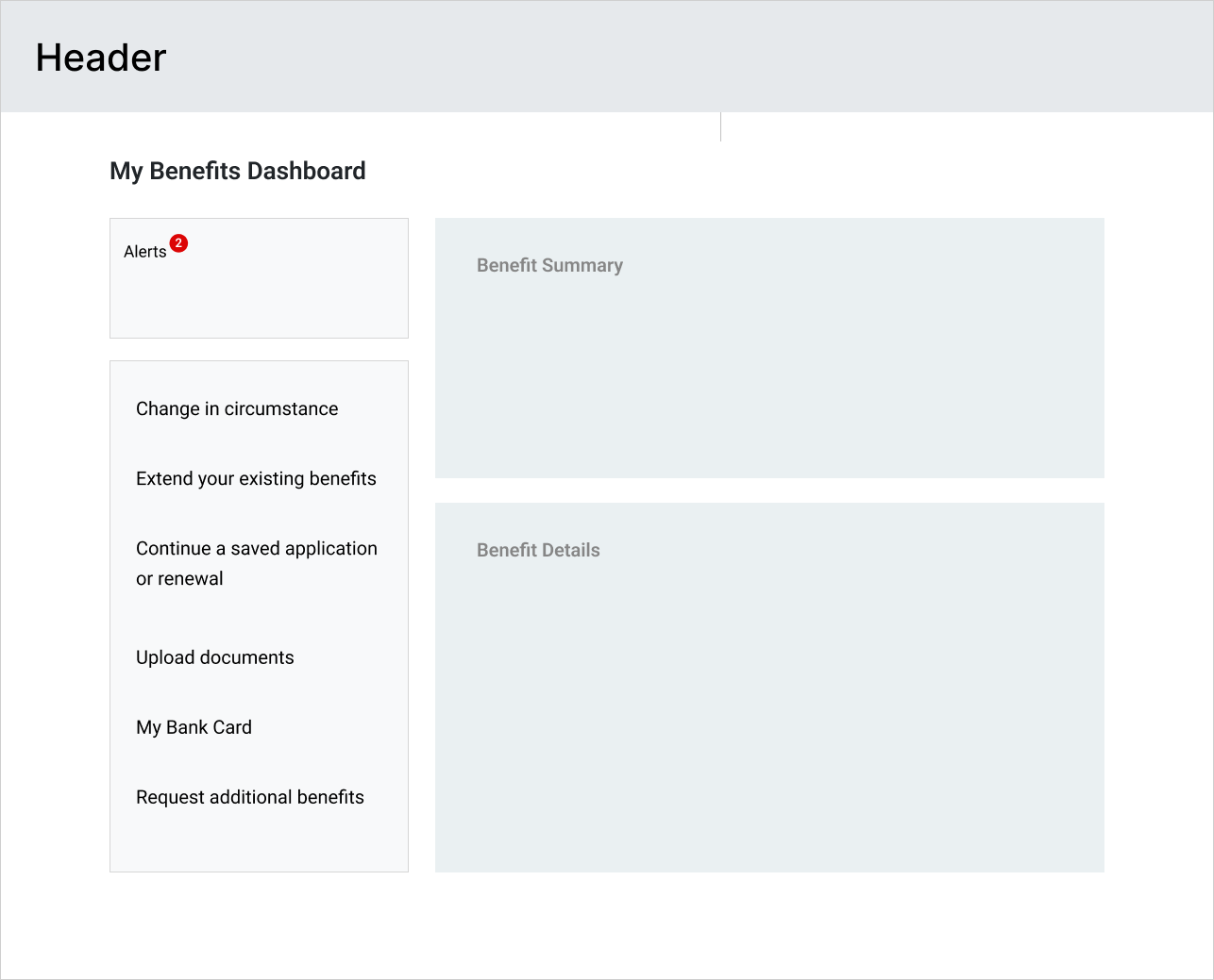
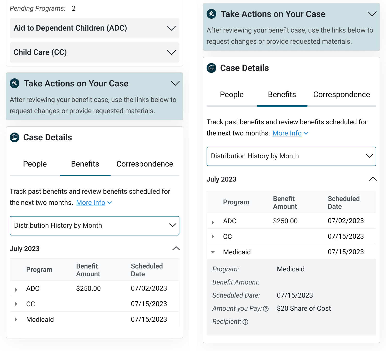
Users start by checking alerts for pending actions to avoid benefit delays, then review their benefit summary for an overview of active and pending programs.
Next, they can explore case details to verify associated people and information, confirm payment schedules and amounts, and review correspondence history and statuses.
Impact After a Year
220,203
Unique site visits
+20%
Applications processed
100%
Released on-time
$0
Over budget
After the dashboard was released to production, I was able to obtain some metrics from stakeholders a year later. What stood out was the high traffic: of approximately 340,000 Nebraskans who receive state and federal benefits, 220,203 visited the dashboard. This means 65% of benefit recipients accessed their information through the platform.
Caseworkers also reported fewer support calls (though not formally measured), and the department processed 20% more applications compared to the previous year—roughly 32,754 more people receiving benefits faster.
Furthermore, the dashboard was released on time, required no additional enhancements, and stayed within budget. This successfully met the business’s deadline and budget goals.
Designing With Constraints
Before diving into the redesign, I felt it was important to identify key constraints early on to understand how they would affect the project's outcome.
Upcoming Deadline
Given a 4 month timeline, turnaround for the redesign needed to be quick.
No Major Visual Changes
Some features were approved by stakeholders so a full redesign wasn't needed.
Strict Budget
Due to the proposal and budget approval process, major post-release enhancements are not preferred.
Key Findings From Stakeholder Interviews
After understanding the constraints, my next step was to gather as much information as possible about the dashboard. Here were the key questions I asked stakeholders to get more insights.
❓ Why was the dashboard being built?
The Department receives many calls from users inquiring about their benefits. However, there is a limited number of caseworkers available to handle them. This has led to bottlenecks in processing new applications.
🎯 Who is the target audience?
Nebraska residents applying for benefits like healthcare or food assistance. This includes first-time applicants and returning users checking or updating their information.
⚠️ What are the challenges with the current solution?
Frustrating Interactions:
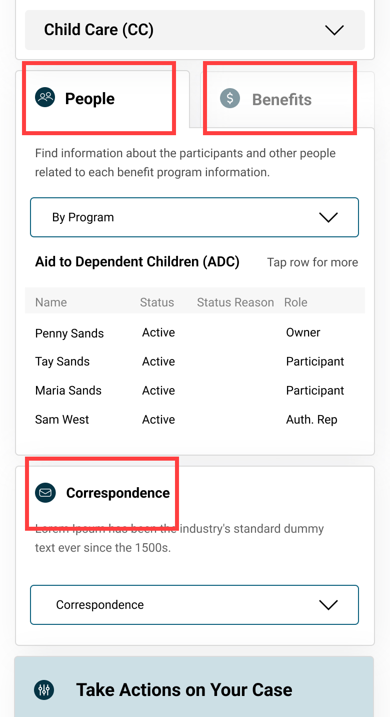
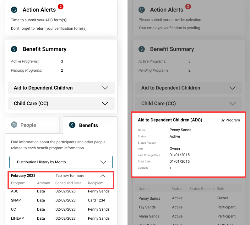
- Stakeholders felt the UI was frustrating to use when trying to view details for multiple benefits.
- They also had a hard time reading information from the data tables.
✅ What does success look like?
User Goal:
- To easily check the status of their applications/benefits and complete any required steps.
Business Goal:
- Streamline application processing to deliver benefits to residents faster.
Secondary Research Uncovered More Challenges
For secondary research, I reviewed earlier versions of the dashboard to understand its history and the reasoning behind certain design decisions. However, the last three versions showed only minor functional and visual updates.
When I followed up with stakeholders about this, I discovered that the designs had never been user tested. This presented a significant gap, as it leaves critical questions about usability and user needs unanswered. Addressing this presented a major opportunity to improve both the design and user experience.
When I followed up with stakeholders about this, I discovered that the designs had never been user tested. This presented a significant gap, as it leaves critical questions about usability and user needs unanswered. Addressing this presented a major opportunity to improve both the design and user experience.
Outlining an Action Plan for the Solution
Based on the insights gathered, I wanted to create an action plan to streamline the design process. Since no user testing had been conducted, I began with a usability heuristic evaluation to identify major issues that a usability test would likely uncover. This approach allowed me to address obvious problems first, reserving user testing for solution refining later.
Start
1
Usability Heuristic Evaluation
Conduct a heuristic evaluation to confirm stakeholder concerns and uncover any additional usability issues.
2
Design Solution
Design a solution addressing these concerns and present it to stakeholders for feedback and approval.
3
Test + Iterate
Conduct usability testing to refine the solution. Although not required, I felt it was essential to get unbiased feedback and identify any pain points that might have been overlooked.
4
Follow up
Follow up post-release to gather operational metrics, assess improvements, and iterate as needed.
End
Creating a Component Library and Style Guide to Streamline Current and Future Projects
Before starting the heuristic evaluation, I reviewed the department’s existing applications to get a better sense of their overall branding and style. This uncovered significant inconsistencies in design across different applications.
Discussions with the engineering teams revealed that without general guidelines, maintaining a cohesive look was challenging since teams worked independently. To address this, I developed a style guide to help both developers and the business create a more consistent and unified experience.
Discussions with the engineering teams revealed that without general guidelines, maintaining a cohesive look was challenging since teams worked independently. To address this, I developed a style guide to help both developers and the business create a more consistent and unified experience.
Style Guide
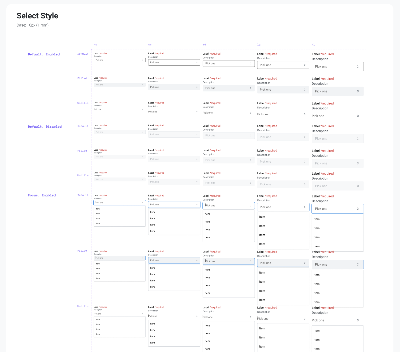
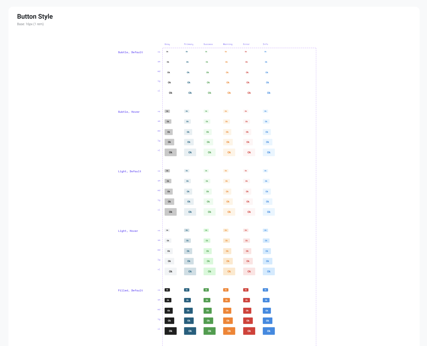
While developing the style guide, I also noticed that a Figma component library was missing, even though design work had been in progress for a while. This created an opportunity to incorporate one that aligned with the engineering team’s React component library to improve consistency and efficiency.
Design System Component Library
Below are partial screenshots of some (not all) elements in the component library
Main Usability Concerns and How They Were Resolved
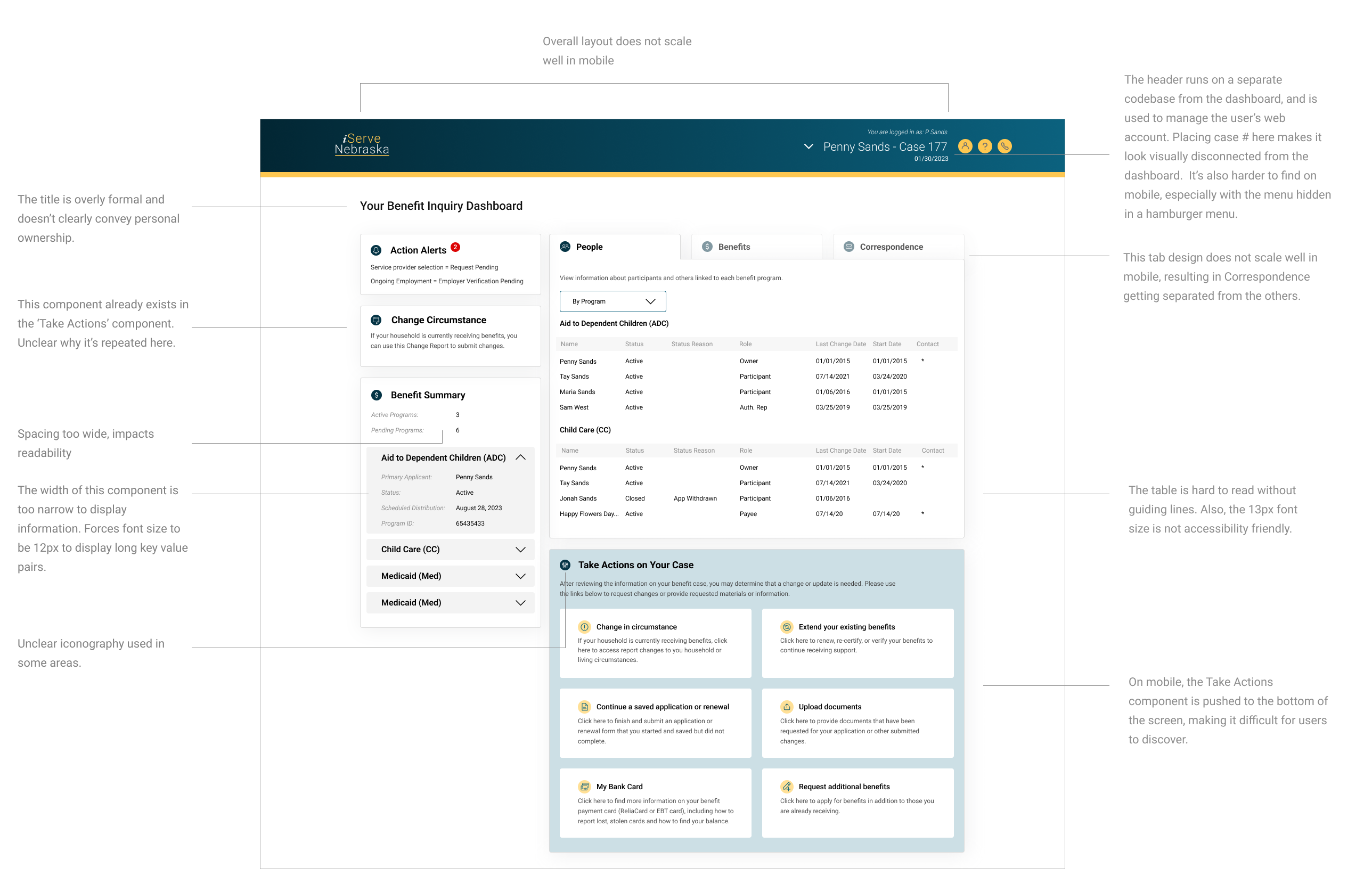
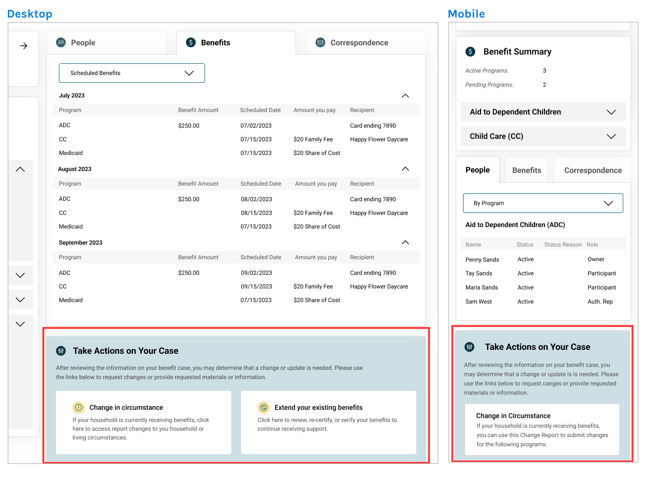
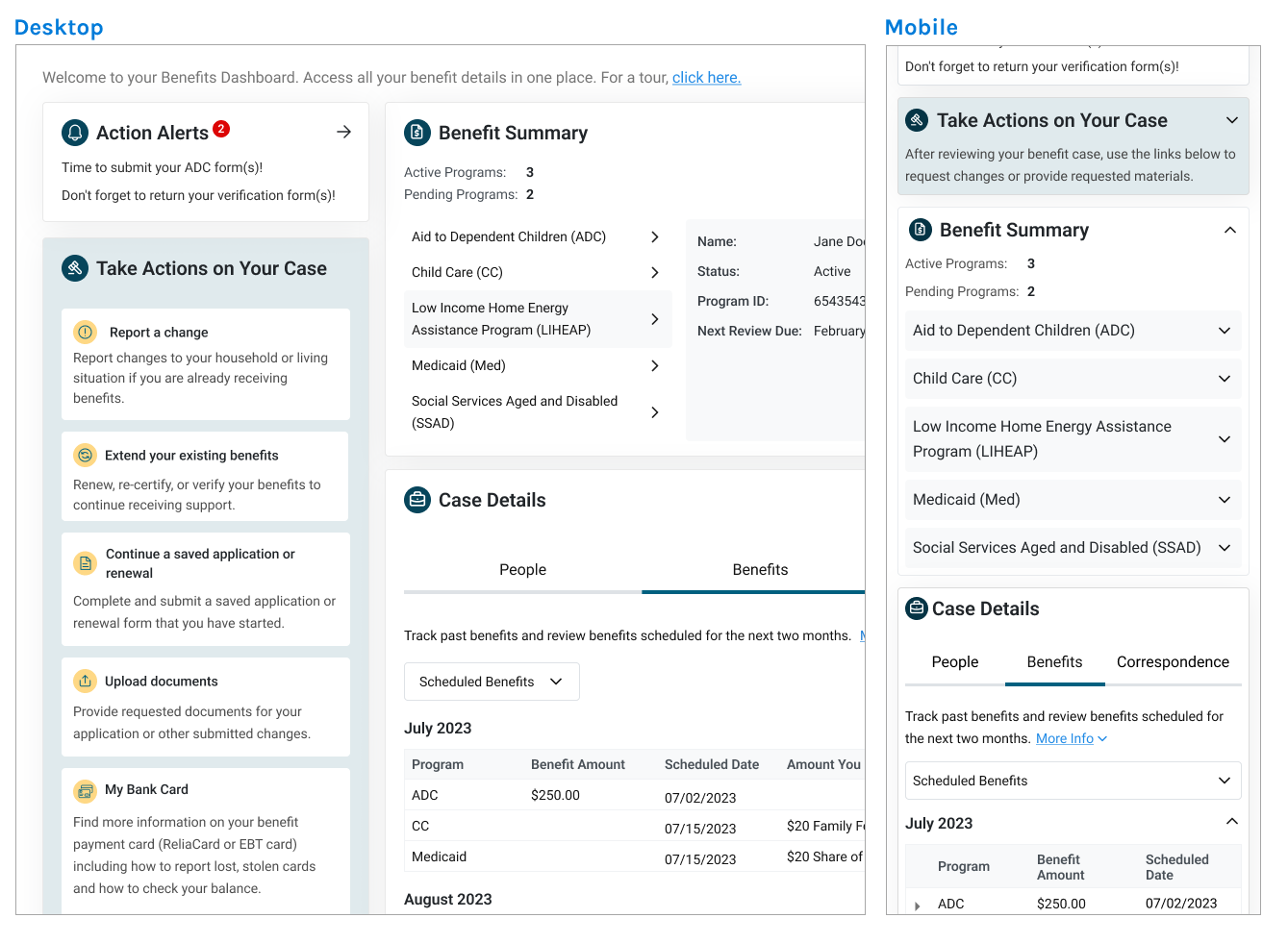
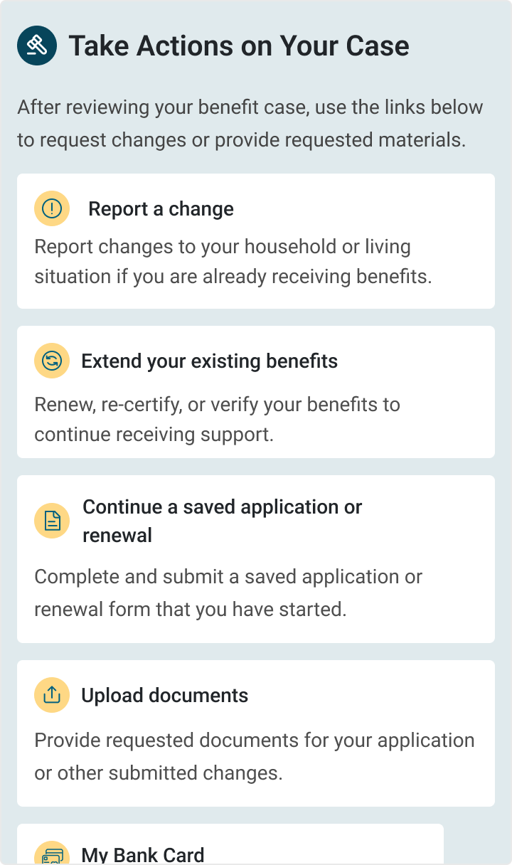
While doing an initial review of the dashboard, I was able to identify several areas for improvement, with the biggest usability issue stemming from the mobile design being an afterthought. Since 60% of users accessed the application on mobile, improving the mobile experience became a top priority.
Below are some key usability issues I discovered.
Below are some key usability issues I discovered.


